
You have unlimited access as a PRO member
You are receiving a free preview of 3 lessons
Your free preview as expired - please upgrade to PRO
Contents
Recent Posts

- Object Oriented Programming With TypeScript
- Angular Elements Advanced Techniques
- TypeScript - the Basics
- The Real State of JavaScript 2018
- Cloud Scheduler for Firebase Functions
- Testing Firestore Security Rules With the Emulator
- How to Use Git and Github
- Infinite Virtual Scroll With the Angular CDK
- Build a Group Chat With Firestore
- Async Await Pro Tips
Angular Elements Quick Start Guide
Episode 102 written by Jeff Delaney
Elements is easily the most exciting thing happening in Angular Ecosystem in 2018. In this lesson, we will build an simple poll component (with Angular v6) that can save user responses to Firestore. Then we will use Angular Elements to bundle this component as a single JS file and use it as a custom element on any webpage.
Full source code Angular Elements Quick Start with Firebase.
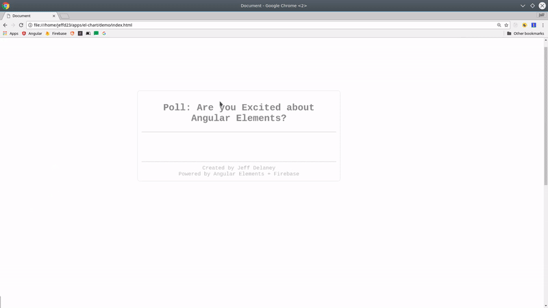
Look, it’s an Angular Component outside of Angular!
The content pages on AngularFirebase.com are just static HTML, but below you are looking an Angular Elements component embedded in this page - that was not possible until very recently. On top of that, I added AngularFire2 to the component to give us full access to Firebase. Try it out!
The code to render this component…
<user-poll></user-poll> |
Initial Setup
Let’s start by generating a new Angular CLI app and installing Elements.
Angular Version: 6.0.0
RxJS Version: 6.0.0
ng new elementsApp |
UPDATED for Angular v6.0
May 3rd, 2018
The Angular CLI v6.0 shipped with a new command that makes it easier to add elements to your project. In the video we installed elements and added polyfills manually, but the new add command will handle all that stuff that automatically.
ng add @angular/elements |
Install AngularFire
I want my Angular Elements component to have access to the Firestore database, but this part is completely optional. If you’re only interested in how to use elements, skip ahead.
npm i firebase angularfire2 rxjs-compat --save |
Update your src/app.module.ts
const config = { ... } |
Build a Component
Now it’s time to build our component. It is a simple user poll that will record the yes/no responses from users in the Firestore database. There is really nothing special about this component - you can build components for Angular Elements just as you would normally. However, there are certain limitations with content projection and data binding, but that’s beyond the scope of this quick start tutorial.
Styling CSS with Shadow DOM Encapsulation
One important concept to mention is that our component is using the shadow dom to isolate our CSS styles. This means the CSS will be compiled to JavaScript, rather than regular CSS, allowing us to bundle the entire component with just a single script. Although technically optional, I recommend using the this Native View Encapsulation strategy.
import { Component, OnInit, ViewEncapsulation } from '@angular/core'; |
Full Component Code
I will not waste your time explaining the component. It’s just a regular Angular Firebase component with nothing special required for Elements.
import { Component, OnInit, ViewEncapsulation } from '@angular/core'; |
The component HTML will record the response on a button click, then display the results.
<aside> |
My component also has a bunch of CSS styles, grab them from full source code on Github.
How to Use Angular Elements
Now we are ready to jump into the Angular Elements magic. With just a few simple steps, we will transform our component into a custom element. Checkout the docs if you’re interested in the finer details of how Angular Elements works.
Convert an Angular Component to a Custom Element
Converting an Angular Component to a custom element can be accomplished with a few simple steps.
- Add your component to
entryComponents. This is required for any component that is defined, but not directly declared in the app. - Implement the
ngDoBootstrapmethod to manually bootstrap that app. - Call
createCustomElementto covert Angular’s component architecture to native DOM APIs.
Your app.module should looks something like this:
// ... |
Remove the App Component
Because we’re manually bootstrapping the app, we can just get rid of the app component and and everything inside of the HTML entry point. (Note: This is not required, I just want to prove that we’re really working with custom elements here).
Add your custom element to src/index.html.
<user-poll></user-poll> |
Now serve the app with ng serve to make sure that your custom element is working just like it would in a normal Angular app.
Using Angular Elements outside of Angular
At this point we have a working custom element, but how do we use it outside of our Angular CLI project? The answer is simple… We just need to export the JavaScript.
Currently, running ng build --prod will generate three separate bundles for the app - main, polyfills, and inline. All we need to do is concatenate these files into a single script.
Keep in mind, the Angular CLI will likely handle most of this heavy lifting for us in the future. I will keep this document updated, but always refer the official docs for the latest and greatest information.
Let’s install a few Node packages to make life easier.
npm install fs-extra concat --save-dev |
Now create a new file called build-script.js. It will take our three JS bundles and merge them to a single file in the elements directory.
const fs = require('fs-extra'); |
Lastly, let’s add a build command to NPM scripts in package.json.
"scripts": { |
Run npm run build:elements and you’re done! Use for your Angular Elements component on any web app.
<user-poll></user-poll> |
The End
Elements will allow Angular to penetrate a much larger category of web applications because it no longer needs to take over the entire DOM. Developers can build single-purpose components and drop them into any existing web application. This is huge! I’m really excited to see this area of Angular evolve in the near future.