
You have unlimited access as a PRO member
You are receiving a free preview of 3 lessons
Your free preview as expired - please upgrade to PRO
Contents
Recent Posts

- Object Oriented Programming With TypeScript
- Angular Elements Advanced Techniques
- TypeScript - the Basics
- The Real State of JavaScript 2018
- Cloud Scheduler for Firebase Functions
- Testing Firestore Security Rules With the Emulator
- How to Use Git and Github
- Infinite Virtual Scroll With the Angular CDK
- Build a Group Chat With Firestore
- Async Await Pro Tips
Realtime Charts With Plot.ly
Episode 39 written by Jeff Delaney
With the rise of big data and deep learning, the importance of data visualization has never been more important. I am a huge fan of data science competitions and think Plot.ly offers the best open source JS library for creating charts, graphs, heatmaps, etc.
In this episode, we are going to add Plot.ly to our Angular4 application. To really make things exciting, are going to wire up realtime data on the backend with Firebase and update the charts asynchronously.
Adding Plot.ly to Angular
There are some issues using plotly.js node package with webpack, but we can still use the library by loading it at build time with the Angular CLI.
install plotly.js
First, install the Plotly.js node package.
npm install plotly.ls --save |
angular-cli.json
Then add it to the angular CLI
Make sure to restart your local server at this point to ensure the script is loaded into your project. Also, if you don’t need the full plotly library, you can use a smaller subset, such as plotly-finance or plotly-basic. You will find these scripts in node_modules/plotly.js/dist/
typings.d.ts
Lastly, we need to register the Plotly class with TypeScript in the typings file.
declare var Plotly: any; |
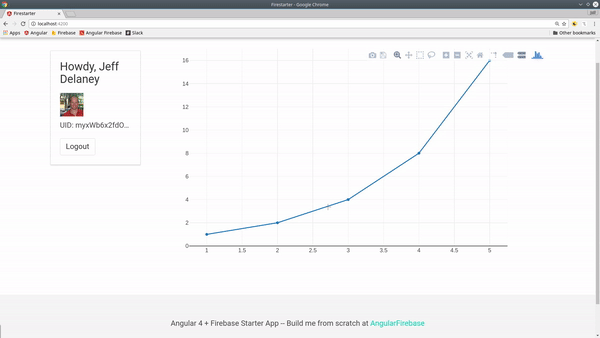
The Most Basic Example
Let’s start with a basic hello world static chart.
ng g component cool-chart |
cool-chart.component.ts
First, we need to let Angular access the div in the HTML where the chart will be displayed. We can do this by using the following syntax in the HTML
<div #chart> |
Then we can call @ViewChild('chart') to get a hold of that div.
import { Component, OnInit, ViewChild, ElementRef } from '@angular/core'; |
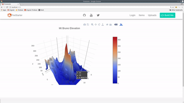
3D Topographic Chart with Firebase Data
Now let’s integrate Plot.ly with the Firebase database. For this example, our data will be only be queried once (no realtime connection).
database structure
We have a database of arrays that correspond to the elevation of Mt Bruno in Quebec Canada. You find the original dataset here. We have a 2D array, or an Array of Arrays.
elevations |
chart.service.ts
Now we need a service to handle the retrieval and updating of this data.
import { Injectable } from '@angular/core'; |
updated cool-chart.component.ts
When creating the chart this time, we take one round of data, subscribe to it, then execute the topoChart() function.
Inside this function we format the data into an object, then pass some layout configuration options. Et voila, we have an amazing 3D chart in our Angular app.
/// ...omitted |
Chart with Realtime Data Link
Now let’s build a chart that can handle realtime data. This type of chart shows the relationship between 3 different data properties. Imagine you have a ranking system that assigns a number between 0 and 100 to the fields of developer, designer, and analyst.
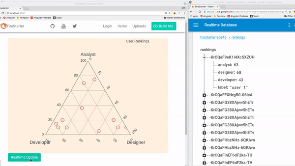
Database Structure
This time we are dealing with objects in the database, as opposed to arrays in the previous example.
rankings |
updated cool-chart.component.ts
This time we subscribe the Firebase database and keep the subscription open. To update the chart we need to either purge it from its host element, or pass data to it with the plotly.restyle function. In this example we just purge the chart for the sake of simplicity.
ngOnInit() { |
That’s it for realtime charts with Plotly. This is only scratching the surface, so check out the documentation examples for inspiration.