You have unlimited access as a PRO member
You are receiving a free preview of 3 lessons
Your free preview as expired - please upgrade to PRO
Contents
Recent Posts

- Object Oriented Programming With TypeScript
- Angular Elements Advanced Techniques
- TypeScript - the Basics
- The Real State of JavaScript 2018
- Cloud Scheduler for Firebase Functions
- Testing Firestore Security Rules With the Emulator
- How to Use Git and Github
- Infinite Virtual Scroll With the Angular CDK
- Build a Group Chat With Firestore
- Async Await Pro Tips
Bootstrap 4 Collapsable Navbar With Angular and No Plugins
written by Jeff Delaney
I love Bootstrap, but it depends on some jQuery and some other JS libraries that I’d rather not have polluting my project. Coding Angular components pure TypeScript makes them more predictable and easier to test. So how do we get the Bootstrap 4 (version alpha.6) top navbar to work properly without jQuery?
Build the Component
ng g component ui/top-nav |
Then paste the default bootstrap top nav code into the template.
Open and Shut
When the bootstrap top nav opens, it is simply adding a show CSS class to div holding the menu items. We can make this work in Angular by simply binding this class to a variable in the component TypeScript.
ui/top-nav.component.ts
export class TopNavComponent { |
ui/top-nav.component.html
Now we can bind the show class from bootstrap to the boolean variable.
<button (click)="toggleCollapse()" class="navbar-toggler navbar-toggler-right" type="button"> |
It works! That’s the easiest way to make the navbar to open and close.
Recreating Navbar Animation
The main thing missing at this point is the sliding animation. Rather than try to port bootstrap’s animation to Angular by toggling CSS classes, I recommend using Angular’s animation module. It will give you more flexibility to customize the animation to fit your app’s UX design.

Let’s scrap the show variable and declare a new variable toggleCollapse with type string. We will also update the function to toggle this variable when the user clicks the button. The state needs to be a string to work with Angular’s animation module.
|
Now for the animation code. Starting in Angular 4, the animation module is not baked in, so make sure to bootstrap it in the app module if necessary. Angular animations are basically just a way to organize CSS3 animations, so you need to have some prerequisite knowledge of CSS animations - otherwise this code won’t make much sense. This is what is happening step-by-step.
- We have two possible states “open” and “closed”
- Each state has its own resting CSS style
- The transition between CSS properties is animated, which you can control with timing, easing, and steps.
The animation code defines how the CSS should behave between two states “open” and “closed”. When going from closed to open, it slides down the y-axis because its closed CSS class is
transform: translate3d(0, -100%, 0). The transition between states can be controlled by setting the timing and ease functions.
import { Component, OnInit } from '@angular/core'; |
In the template, we can use the @ symbol with the name of the animation trigger and pass it the state. Now we have a sliding navbar animation that can be customized directly from the Angular component.
<div class="collapse show" [@collapse]="collapse"> |
Final Touch - Toggling Hamburgers and Crosses
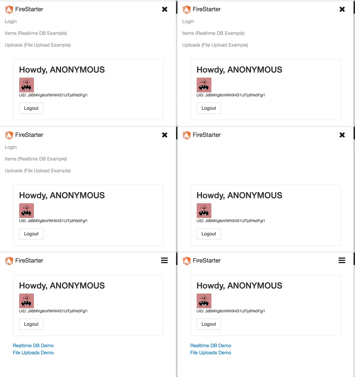
We can use the collapse variable to show a hamburger when the menu is opened and a cross when it is closed. Bootstrap does not do this by default, but it’s a nice touch and could be refined further with its own animation code.
<span [hidden]="collapse=='open'" class="fa fa-bars fa-lg"></span> |

